
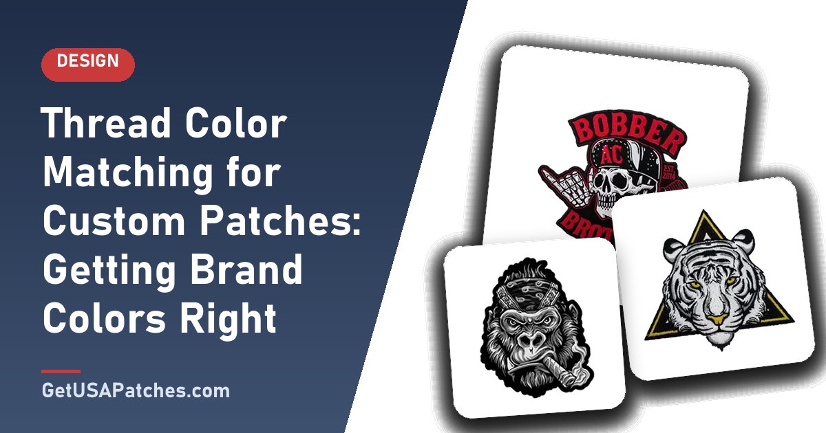
Brand colors matter, and thread behaves differently from ink on paper or pixels on a screen. Here is how to get the closest result.
Why colors look different in thread
Screens emit light, print uses ink, and thread reflects light from a textured surface. The same color can look slightly different in each medium, so an exact match is not possible — but a close match is.
How to specify colors
- Send Pantone (PMS) numbers when you have them.
- Send hex or RGB values from your brand guide.
- Send a physical sample if color is critical.
- Confirm colors on the digital mockup.
| Method | Accuracy | Tip |
|---|---|---|
| Pantone (PMS) numbers | High | Best for brand standards |
| Hex / RGB values | Good | Use for screen-based brands |
| Physical sample | Very high | Mail or describe the sample |
| Photo reference | Moderate | Lighting affects color |
Tips for better results
- Use high contrast between text and background.
- Limit similar shades side by side — they can blend.
- Keep gradients out of embroidery; use printed patches for blends.
- Choose a border color that suits the garment.
Embroidered vs. woven vs. printed color
- Embroidered: thread colors matched to your palette.
- Woven: multi-color thread with fine detail.
- Printed: unlimited colors and gradients.
Get it approved
Your free digital mockup shows the planned colors. Review it carefully and ask for changes before production. See also our artwork file guide.
Why colors shift between screen and thread
- Screens emit light; thread reflects light.
- Thread has sheen and texture that alters perceived color.
- Adjacent colors influence each other.
- Fabric base color can change how thread looks.
Color strategy for patches
- Pick a limited palette of two to five colors.
- Ensure strong contrast between text and background.
- Avoid using several similar shades side by side.
- Choose a border color that suits the garment.
- Confirm colors on the mockup before approving.
When to choose printed patches for color
If your artwork has gradients, shadows or photographic color, printed patches reproduce it more faithfully than thread. See our printed patches page.
How to build a patch color palette
- Start with your brand’s primary and secondary colors.
- Add one neutral (white, black or gray) for text.
- Check contrast between each pair of adjacent colors.
- Limit the palette to what the patch size can support.
- Confirm the palette on the mockup.
Special effects and materials
Metallic threads, reflective materials and glow effects may be available for some patch types. Availability depends on the patch style and the effect, so ask about options when you request a mockup.
Ensuring color consistency across reorders
- Save your approved mockup and thread color notes.
- Reference the same Pantone values on each order.
- Reorder from the same supplier.
- Compare a new batch to an earlier patch when it arrives.