
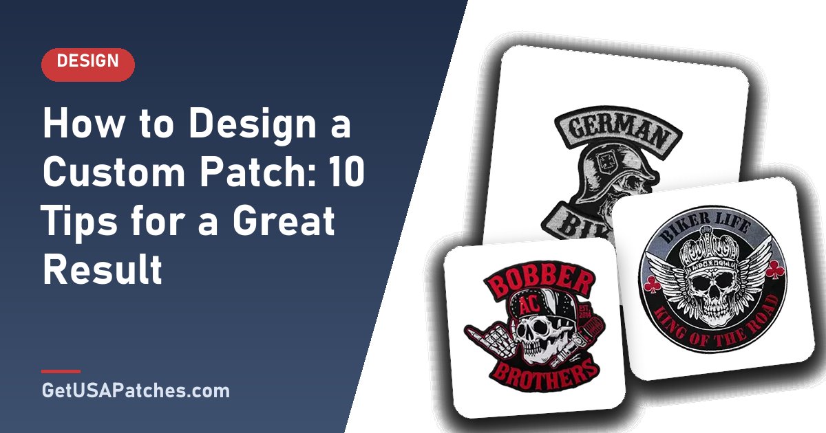
A good patch design feels effortless, but it follows a few practical rules. Thread, weave and rubber behave differently from pixels on a screen, so a design that looks great on a monitor needs a little adaptation.
Use these ten tips to get a patch that looks as good on the jacket as it does on the mockup.
Ten design tips for custom patches
- Start with the placement. A hat patch and a back patch have very different size limits.
- Keep it simple. Bold shapes and clear outlines read well from a distance.
- Limit the color count. Fewer colors mean cleaner results and often lower cost.
- Keep text large. For embroidery, aim for lettering at least about 1/8 inch tall.
- Use strong contrast. Light text on dark backgrounds (or the reverse) stays legible.
- Leave breathing room. Space between elements prevents thread from blending together.
- Choose the right border. A merrowed border frames rounded shapes; hot-cut suits detailed silhouettes.
- Think about texture. Embroidery adds depth; woven is flat; PVC can be raised.
- Avoid gradients in thread. Use printed or woven patches when you need smooth color blends.
- Approve the mockup. Review size, colors and details before production starts.
Pick the patch type that suits the design
- Bold logo or lettering: embroidered.
- Tiny text or thin lines: woven.
- Photos or gradients: printed.
- Outdoor or tactical use: PVC.
Preparing your artwork
Vector files (AI, EPS, PDF) give the cleanest results, but PNG or JPG files work too, and we can recreate artwork from a clear photo or sketch. Read our artwork file guide for details.
Common design mistakes
- Using too many tiny details.
- Low-contrast color pairs.
- Text that is too small for the patch size.
- Forgetting how the patch will be attached (backing).
GET A FREE MOCKUP
If you are still choosing type, size, or backing, send the artwork and the garment. Free digital mockup before production — 10-piece minimum. We do not produce until you approve.
GET A FREE MOCKUP
Get a free digital mockup
You do not need to be a designer. Upload your idea on the free mockup form and our team will digitize it, suggest improvements and send a proof before anything is produced.
A simple design process you can follow
- Define the purpose: uniform, brand merch, club, event or gift.
- Choose the patch type: embroidery, woven, PVC, chenille, leather or printed.
- Sketch the layout: icon, text and border.
- Limit colors: choose 2–5 strong colors with good contrast.
- Set the size and backing.
- Send artwork and request the free mockup.
- Refine and approve.
Design ideas by use case
- Business: clean logo in a rounded rectangle for polos and hats.
- Clubs and teams: shield or circle crest with the team name and year.
- Events: a limited-edition design with the date and a bold central icon.
- Fashion: unusual shapes, textured materials and small woven labels.
- Morale and hobby groups: playful characters with short mottos.
Text on patches: best practices
- Choose simple, sturdy fonts (avoid hairline scripts).
- Keep phrases short — three to five words are ideal.
- Add an outline around text on busy backgrounds.
- Check spelling twice; you approve the mockup, so errors are easy to catch.
GET A FREE MOCKUP
Ready to spec the run? Open the quote form for a free digital mockup and shipping to all 50 states after approval.
GET A FREE MOCKUP
Design principles that make patches look professional
- Hierarchy: one focal point, supporting text, minimal extras.
- Contrast: dark on light or light on dark for readability.
- Balance: keep weight evenly distributed within the border shape.
- Negative space: allow breathing room between elements.
- Consistency: match the patch to your existing brand or team identity.
From sketch to stitch: what happens after you send your idea
- Our team reviews the artwork or sketch.
- The design is digitized for stitching, weaving, printing or molding.
- You receive a free digital mockup showing size, colors and details.
- You request revisions until it looks right.
- Once you approve, production begins.
Design mistakes and how to fix them
- Too many colors: choose a limited palette.
- Small text: increase size or shorten the words.
- Busy background: simplify or convert to a solid field.
- Thin outlines: thicken lines to survive stitching or molding.
- No margin: add space between artwork and the border.